My stand on Project Plans and Microsoft Project Files in particular makes me sound like a person who does not believe in planning. More than one individual found my post on project plans; more specifically my ideas on this topic controversial and threw a few punches at me on the topic while we got into a heated debate comparing Agile with some other big design up front methodologies when it came monitoring a project status. My point however, was that the debate didn’t weigh both methodologies objectively.

While Big Design Upfront methodologies like Waterfall, focus on tracking the project status, light weight methodologies are more about tracking the project’s progress. Weighing both of them on the same scale doesn’t seem to make sense. The argument presented was somewhat on the lines of:
|
See when you compare quality in Agile Projects vs. Quality in CMM or RUP projects the quality of CMM and RUP projects is much higher purely because during all this time Agile hasn’t even been able to come up with one decent standard to measure project status. |
The fundamental realm of Agile turns out to be slightly different. Measuring the project status in terms of percentage has never been the strong hold of agile methodologies like scrum. Having said that if you’ve never used agile before and are curious about ways to track your projects ‘health’ and progress using agile, multiple ways exist. Burn down chart happens to be just one of them. Wikipedia does a lousy job at giving details about burn down charts:
|
A burn down chart is graphical representation of work left to do vs. time. The outstanding work (or backlog) is often on the vertical axis, with time along the horizontal. It is useful for predicting when all of the work will be completed. It is often used in Agile software development methodologies such as Scrum. |
With a methodology like scrum you want to monitor progress of:
- Your current sprint.
- Your current release.
- Your final product.
Deciding the definition of done is fundamental to the success of any scrum project. Once you have frozen on the definition of what defines a feature as ‘done’ or ‘complete’ you would typically start by listing out your use-cases, user-stories or plain old features and sub-features.
A typical scrum project that you work on would generally consist of work items in the form of these use-cases, user-stories or plain old features and sub-features. Now if you were to plot point of features ‘remaining’ to be done on the Y-axis and the number of days on the X-axis and you were to get that done every single day of your project you would have something that would look like this:
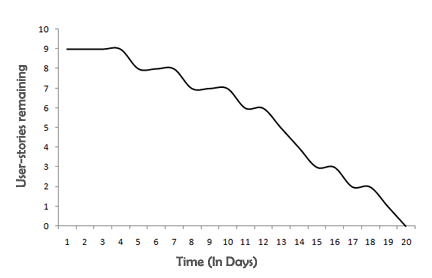
And that my dear readers, is a simple burn down chart.
Going by the basic concept the burn down chart is a rather simple idea which has more to do with ‘wisdom’ than it has to do with knowledge of how to build it. Just like I’ve gone ahead and drawn the burn-down chart for a sprint, you could do it for a release and call it your release burndown. Learning how to draw burn-down charts is a matter of acquiring information which is rather easy to acquire but analyzing your burn-down charts is art of wisdom, not just knowledge of the data and how to transform it into a burn down chart.
If you keep monitoring your burn down chart sprint after sprint and release after release you will realize that you team, has a finite and well defined velocity. Trying to ‘push and pressure’ your team to ship faster than their natural velocity can be suicidal. Let’s monitor a team at Multiplitaxion Inc, who, with their natural velocity, have a burn down chart that looks somewhat like this:
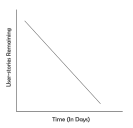
On a side note, burndown charts in real time are hardly ever a straight line, but that’s not the point. Humor me. I have a different point to make and the actual shape of the burndown chart hardly matters.
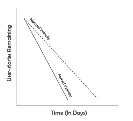
The management at Multiplitaxion Inc, aren’t really happy with this velocity because the competition is catching up faster; so they panic, pressuring the development team to push harder. Given the team leader’s highly complying nature and optimism he agrees and the team starts to work ‘really hard’. They create a little bit of code litter and add a little bit of a code smell, break a few good practices and ship faster. The code ships and the burn-down chart, compared to the one with their natural velocity, looks much like:
Now if you are a young and budding project manager you’re thinking:
|
Hey Pops, The management is happy, the team is happy and the sky is blue with the sun shinning brightly. The development team took their butts off their chairs, stopped playing video games and worked harder. So what? After all no-one was killed. In fact people got praises and promotions for successful implementation. |
That’s perfect. Right?
Wrong.
The sprint ends up being what I refer to as a ‘successful failure’. This example is a classic example of the first window being broken and the broken window theory kick in.
The next sprint, the team needs time to clean the code litter they created, but the competition is catching up, the team lead is acting like a prick and pushing them harder. Now even their old natural velocity isn’t enough to clean up the litter done in the previous sprint and reach the feature complete mark in the given time. They ‘work harder’, create more litter and soon the broken window theory starts to become prominent.
The next sprint takes a little more time only to result in a little more pressure from the management followed by some more litter to seed up the development in the following sprint.
Over a period of time, the code becomes complex to maintain and extend. Features start taking more time to build and the pressure from the business just keeps mounting up. Sprint after sprint more litter is introduced in the code base and the code keeps getting more and more complex. Iteration after Iteration the burndown charts start looking somewhat like:
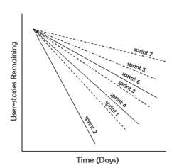
This continues till someone realizes that features are taking too much time to build, it doesn’t even make sense continue to the project and pulls the plug. If you’ve witnessed projects being shut down because development of features was taking too much time the above chart in action is exactly what you’ve witnessed.
Once you get a general idea of your team’s velocity and can ‘see’ it on a burndown chart, keep a close eye on the burndown sprint after sprint. If you see you burndown chart becoming unexpected steeper it doesn’t always mean your team is ‘working harder’. In fact, every time you see the burndown chart going any steeper than the team’s natural velocity you need to stop and ask yourself the following questions:
- Has the team moved to a radical and more efficient technology?
- Have more efficient team members have joined your team?
- Have the features that are being built become blatantly simpler because of change in requirements?
Net-Net you need to keep questioning till you can find a way explains the sudden steepness. If you can’t, the same team usually does not become much more efficient overnight and the steepness might be an indication of people panicking and the broken window theory being kicked off in practice.
Periodic glances on burn down chart are much better than policing your teams with a Gantt Chart. Monitor your burndown charts every now and then and every time they sway on either side, coordinate better.
Comments are closed.